Responsive Images 101 - NaBloPoMo #9
In response to yesterday’s post, it might make sense to provide a brief introduction to Responsive Images.
Short Summary
If you are including images in your website content you should seriously be considering using either:
1) srcset & sizes attributes - which enable you to provide a ‘candidate list’ of different size variants of a given image - for sizing/resolution switching
2) the picture element - which enable you to provide different image sources at different viewport widths, or image formats - for format switching or Art Direction
They both provide low/no risk fallback in that none-supporting browsers just ignore srcset, sizes and the picture element and just use the standard img src value (as they have done for 20+ years).
Either head straight over to the ‘Practical Responsive Images’ site to get hands-on with examples, or read on for a (surprisingly long) brief background and introduciton to Responsive Images.
Background
For over 20 years, if you wanted to use images images in you website you could use the img tag, which took some basic attributes relating to its source.
<img src="folder/image.jpg" />
And that was about it.
Once we’d moved into the era of Responsive Web Design we started having images behave fluidly within our layouts by applying some CSS:
img{
  width: 100%;
}
And that was about it.
Screen sizes and resolutions generally continued to grow.
The importance of website performance continued to be extolled as a core part of the User eXperience, and as a major factor in site engagement. Yet page weights generally continued to grow.
The incredible power and value of imagery on the web was broadly acknowledged, and yet the img tag remained the same simple element as was first proposed in 1993.
Then, thankfully in 2014 through the considerable efforts of the Responsive Images Community Group and a large body of supporters in the broader web community, there was finally an agreement on how the web community and browser developers might take a common approach implementing a more responsive images solution.
Following their painstaking work the < picture > element, and srcset and sizes attrbutes today (2016) are supported by the great major browser manufacturers:
(with the Picturefill polyfill, giving solid support for ‘legacy’ browsers.)
srcset & sizes
The img tag now comes with enhancements of the following forms:
<img srcset="" src="" alt="" />

<img srcset="" sizes="" src="" alt="" />”
This new optional srcset attribute, enables you to provide a set of ‘image candidates’ to handle graphical displays of varying dimensions and pixel densities.
For example, here we provide references to 2 images, and also a w-descriptor value which indicates to the user agent (the browser) the size of the images, such that, based on viewport width and device pixel density, the user agent will automatically select what it considers to be most appropriate image to use:
<img srcset="Butterfly-600px.jpg 600w, Butterfly-1000px.jpg 1000w" src="Butterfly-600px.jpg" alt="text" />
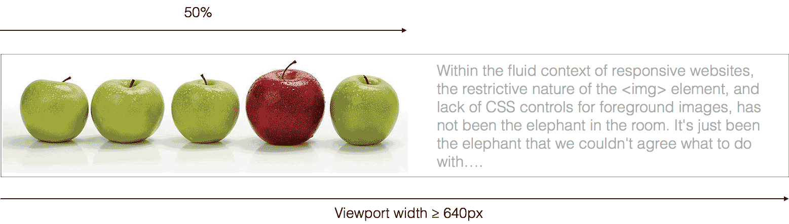
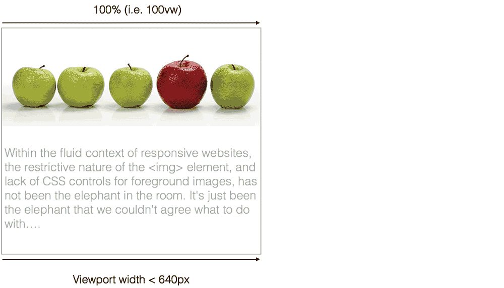
The new optional sizes attribute enables us to provide further details about the % of the viewport width that the image uses for that layout, to aide the user agent in its calculations. In the example below the image takes up 100% of the width (100vw) when the viewport is larger than 640px, and is 50% of the width (50vw) when the viewport width is 640px or less:
<img sizes="(min-width: 640px) 50vw, 100vw"
    srcset="Apples-200.jpg 200w, Apples-400.jpg 400w,
    Apples-600.jpg 600w,Apples-800.jpg 800w,Apples-1200.jpg 1200w"
    src="Apple_fallback.jpg" alt="text" />”
picture element
If all you want to do is change the resolution or size of the image being embedded within your page, the srcset and sizes attributes are all you really need. However, if you’d like to be able to completely change the content delivered depending on the available viewport, pixel density, device orientation, or supported MIME types, you need the picture element.
<picture>
  <source media="" srcset="" sizes="" type="" />
  <source media="" srcset="" sizes="" type="" />
  <img srcset="" src="" alt="text">
</picture>
In this example, we are providing an image in WebP, JPG XR and jpg formats. The user agent will use whichever condition it first successfully matches, hence those browsers supporting WebP will use the first source, those supporting JPG XR will use the second source, and everything else will use good old JPG.
<picture>
  <source type="image/webp" srcset="Apples_600.webp" >
  <source type="image/vnd.ms-photo" srcset="Apples_600.jxr" />
  <img src="/Apples_600.jpg" alt="text" />
</picture>
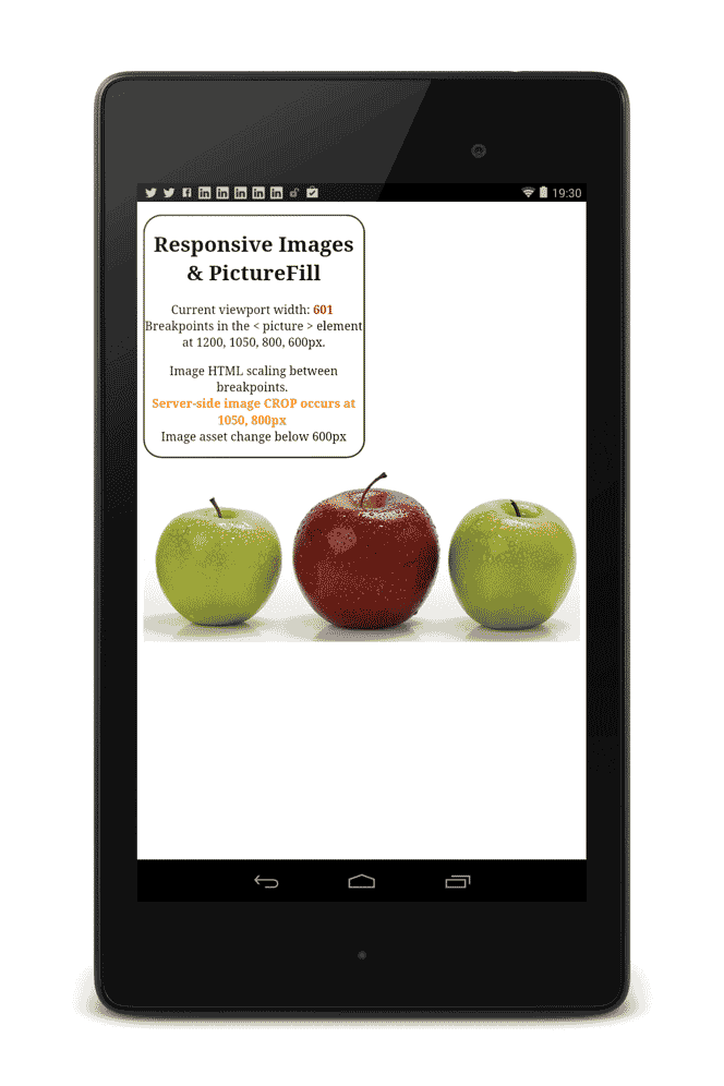
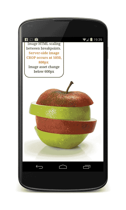
The other main use case for the picture element is Art Direction, which enables us to use completely different images at different viewport widths. Here we reference different ‘crop’, or ‘slice’ variations of an image at different media queries:
<picture>
  <source media="(max-width: 500px)"
          srcset="Apples-slices.jpg, Apples-slices-2x.jpg 2x" />

  <source media="(max-width: 780px)"
          srcset="Apples-crop-500.jpg 500w,
          Apples-crop-780.jpg 780w" />

  <source srcset="Apples-780.jpg 780w, Apples-1000.jpg 1000w,
          Apples-1800.jpg 1800w"/>
  <img src="Apples-fallback.jpg" alt="text" />
</picture>

Epilogue
If you’d like to know more about responsive images, I’ve also started writing this site : http://responsiveimag.es/ and also an eBook titled “Practical Responsive Images”
As a by-product of these more sophisticated mechanisms for embedding our image content into our websites, a new problem arises:
How to prepare, manage, serve, and maintain all these image variants?
While there are several workflows/approaches you can take to create, manage and serve all these image variants, for all bar the smallest of sites, it is probably worth looking into a Dynamic Imaging system, and I’ll go into more detail about that tomorrow …