Jekyll Responsive Images without plugins - NaBloPoMo #8
While there are many improvements that I’m looking forward to making to my Jekyll/gh-pages workflow my current biggest concern is the way that I’m handling images. Currently images are uploaded to Github straight from the iPad/iPhones camera roll as-is, and then served directly into the page, meaning that in many cases we are serving up images that are considerably larger than needed, and not being particularly considerate to our site visitors.
As I’m hosting on gh-pages, I’m unable to utilise any of the Responsive Images plugins available for Jekyll, and as such I’ll be taking a semi-automatic ‘batch-statics’ approach, which has 2 main aspects:
1) Generating image size variants of the image (on my iOS devices)
2) Generating image embed code using srcset to implement responsive images (where supported )
1: Generating image size variants
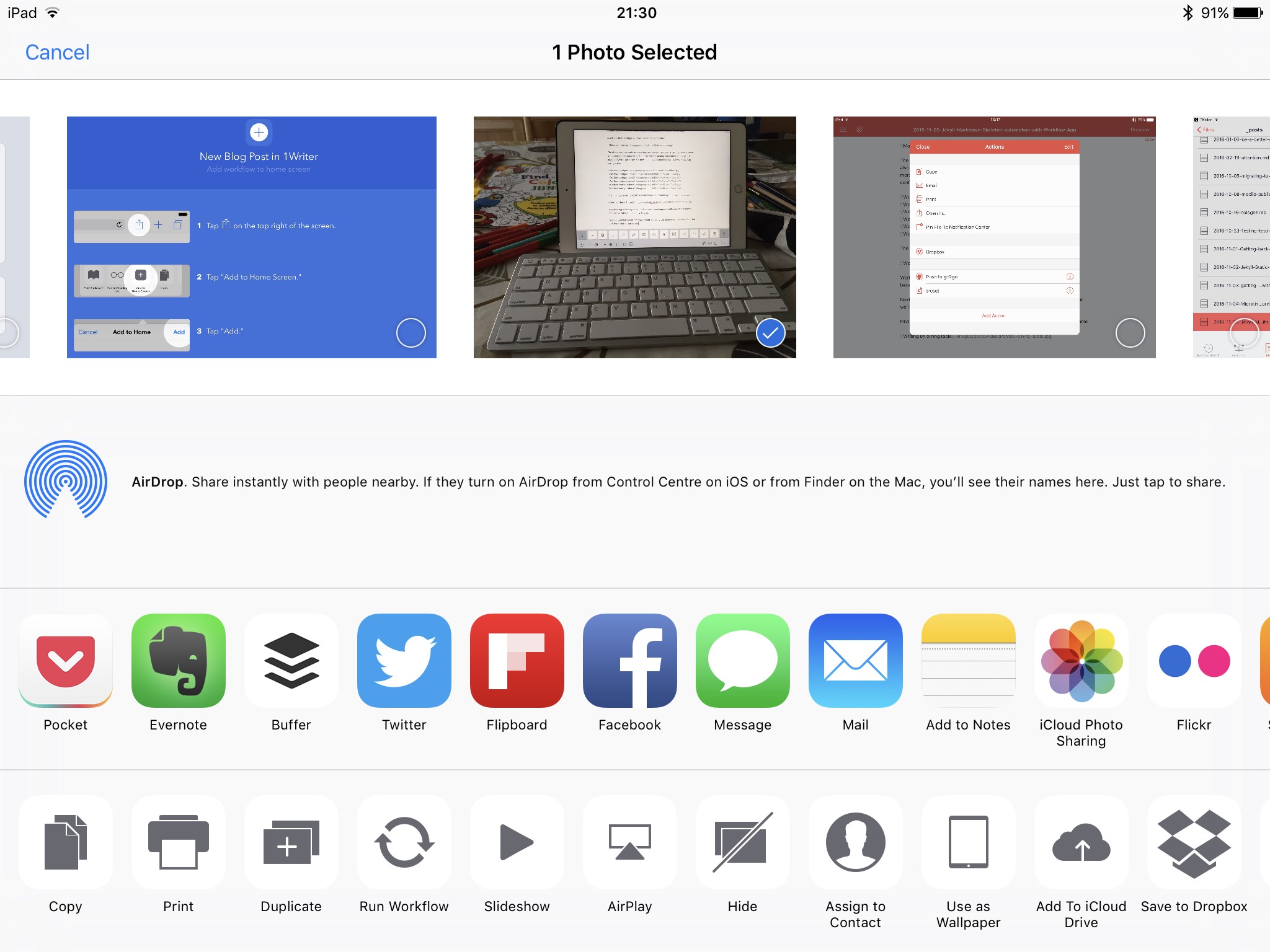
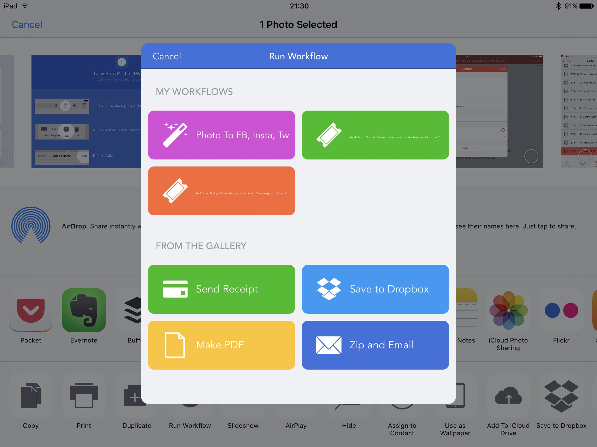
Back to Workflow App, where I’ve setup a workflow which enables me to select one or more images, asks for a new base filename for the image, and then generates multiple resized variants of that image, appending a size relevant name to the base name.
For example, here I selected an image, and now have a ‘run workflow option available:
Enter the new basename for the image filename:
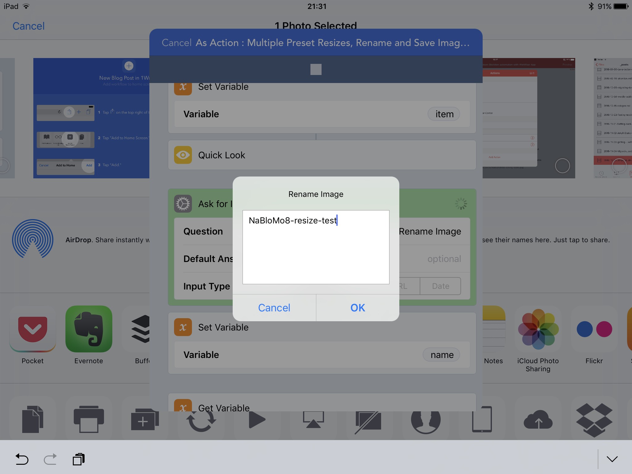
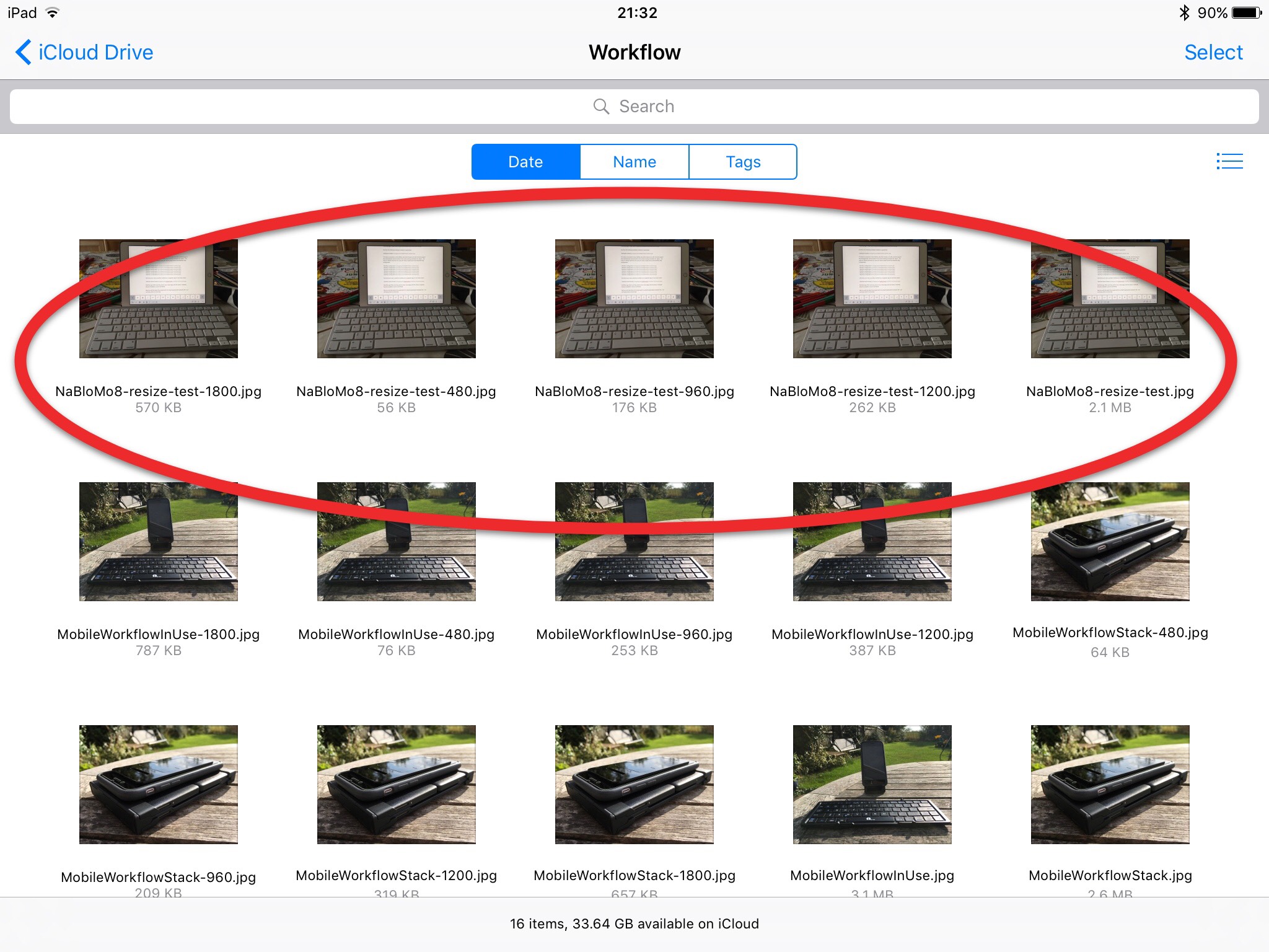
And the following size variants are automatically generated with widths of 480px, 960px, 1200px and 1800px and saved to iCloud:
These can then be uploaded to my repo using Git2Go as we saw in an earlier post. One current limitation of iOS in this is that you cannot multi-select and bulk upload, but have to manually select each image in Git2Go.
2: Generating image embed code using srcset
Standard markdown gives us a simple way to add images, but in order to add more complex embed code for our responsive images, we’re going to need to mix some HTML within our markdown (which is a standard supported approach, and one of the strengths of markdown).
If you are unfamiliar with implementing responsive images, you can find more details at http://responsiveimag.es/ or -cough- the ebook I wrote last year: Practical Responsive Images.
The update to the img tag is a srcset attribute, which contains a comma-separated list of ‘image candidates’ and an associated ‘w-descriptor’ for each image variant, which indicates to the User Agent (browser) the width of that image, such that the User Agent can then use device pixel density and viewport width to select the most appropriate of the images to load. (The src= must still be included and so we have a fallback for non-supporting browsers). Here is an example:
<img src="/images/posts/MobileWorkflowStack-960.jpg"
	 srcset="/images/posts/MobileWorkflowStack-480.jpg 480w,
			/images/posts/MobileWorkflowStack-960.jpg 960w,
			/images/posts/MobileWorkflowStack-1200.jpg 1200w,
			/images/posts/MobileWorkflowStack-1800.jpg 1800w"/>
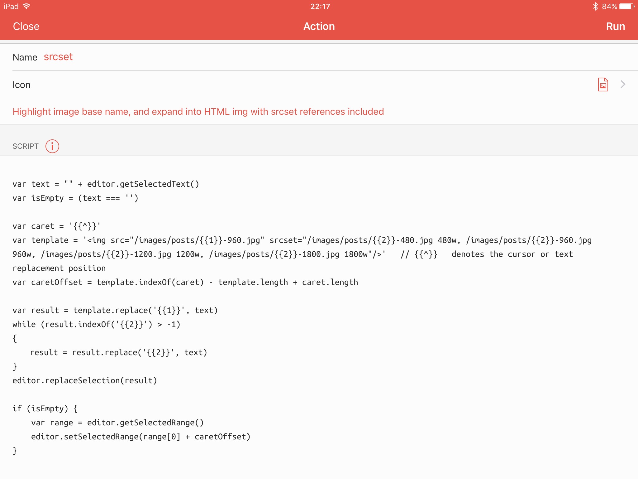
This could be a little laborious and repetitive to key in for each image, and so wrote a 1Writer Action which performs this task for me. To use it, enter and highlight the image basename and then run the action ‘srcset’, and it converts that basename, into html of the format you saw above:
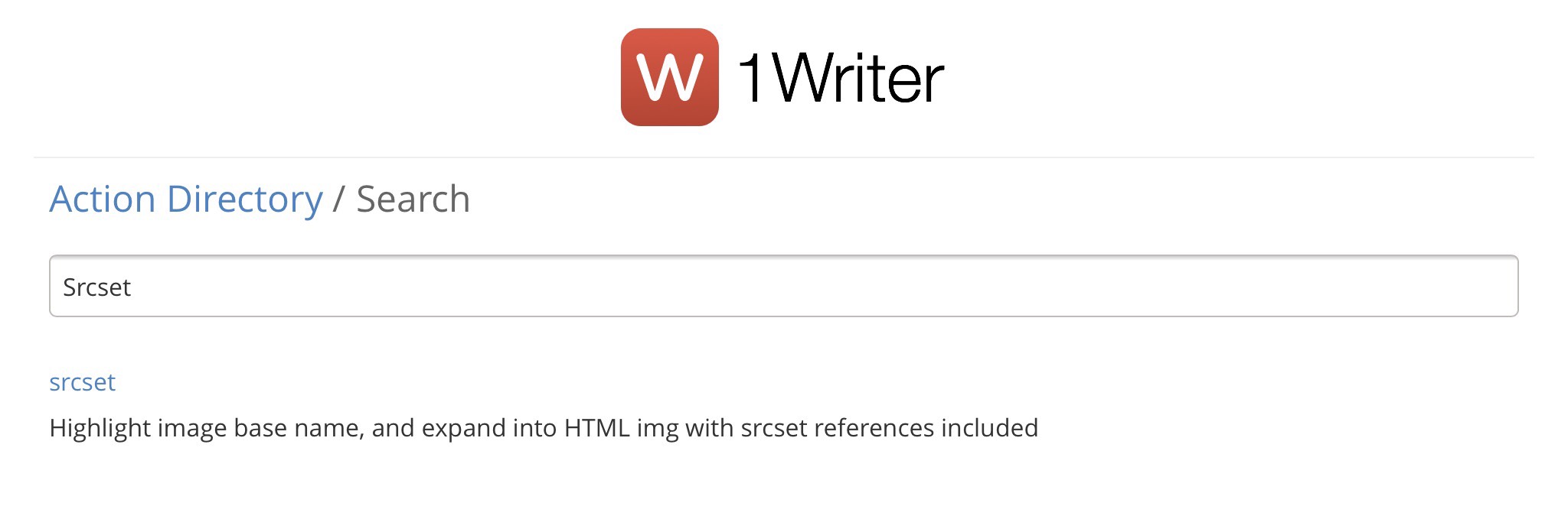
I’ve submitted this to the 1Writer Action Directory, so you can load it from there simply:
ToDo: explore options for generating progressive JPG on an iPad
ToDo: considering utilising a Dynamic Media solution (see note below) for generating all of my image variants from a single master asset, at request-time.
Note: As well as being passionate about the advantages of Responsive Images, I’ve also spent a fair chunk of the last decade working with the world’s most capable enterprise Dynamic Media systems (if you’re curious, please ping me, or check out the Amplience Website.