Practical Responsive Images – Crop to point of interest
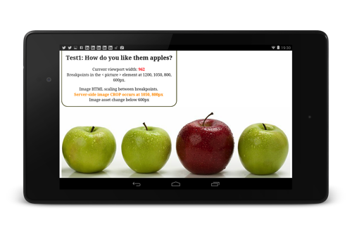
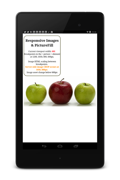
Following on from yesterday’s <a title=”Practical Responsive Images with Picturefill” /2014/05/17/practical-responsive-images-with-picturefill-1/” target=”_blank”>Practical Responsive Images</a> post, the next example use of the < picture > element (and using Picturefill), is to apply a point-of-interest crop to an image to maintain the desired focus at different breakpoints.
Demo : http://responsiveimag.es/picturefill2_cropApples.html
In this example, I’m apply different at-request-time crops depending at different min-width’s, with html scaling between those breakpoints.
min-width: 850px : …?pcrop=700,0,2500,800
min-width: 600px : …?pcrop=1300,0,1900,800
smaller than that, use a different, focused image request
(full code snippet below)
[Update: I’ve now launched a separate site focused on Practical Responsive Images: http://responsiveimag.es/ ]
Initial device testing is looking good, screen shots from Nexus 4 and Nexus7

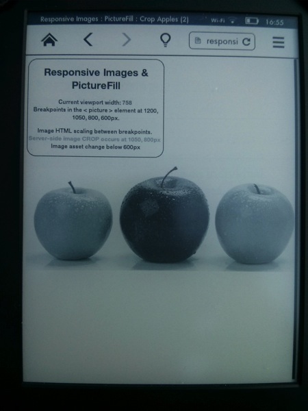
Even Kindle Paperwhite’s view of that page:
`Following on from yesterday’s Practical Responsive Images post, the next example use of the < picture > element (and using Picturefill), is to apply a point-of-interest crop to an image to maintain the desired focus at different breakpoints.
Demo : http://responsiveimag.es/picturefill2_cropApples.html
In this example, I’m apply different at-request-time crops depending at different min-width’s, with html scaling between those breakpoints.
min-width: 850px : …?pcrop=700,0,2500,800
min-width: 600px : …?pcrop=1300,0,1900,800
smaller than that, use a different, focused image request
(full code snippet below)
[Update: I’ve now launched a separate site focused on Practical Responsive Images: http://responsiveimag.es/ ]
Initial device testing is looking good, screen shots from Nexus 4 and Nexus7


Even Kindle Paperwhite’s view of that page:

`
Any questions or comments : @bseymour