Practical Responsive Images with PictureFill (#1)
Thanks to the work of the Responsive Images Community Group and key supporters, the industry is gaining considerable momentum towards implementing the **
Both of these could finally offer a standard solution to the gnarly problem of providing a mature and consistent approach to implementing images effectively, especially within Responsive Websites, and potentially also bringing some Web Performance benefits.
Ahead of full take-up, and considering future-legacy-browers, there is an updated version of Scott Jehl’s PictureFill: https://github.com/scottjehl/picturefill.
As such, you can seriously considering implementing a better images approach *today*.
First steps to try:
– grab a copy of picturefill.js
– Use the
<br />
<picture><br />
<!--[if IE 9]><video style="display: none;"><![endif]--><br />
<source srcset="/image1_big.jpg" media="(min-width: 1000px)"><br />
<source srcset="/image1_medium.jpg" media="(min-width: 800px)"><br />
<source srcset="/image_small.jpg"><br />
<!--[if IE 9]></video><![endif]--><br />
<img srcset="/image_fallback.jpg alt="context"><br />
</picture><br />
[Update: I’ve launched a separate site focused on Practical Responsive Images: http://responsiveimag.es/ ]
###
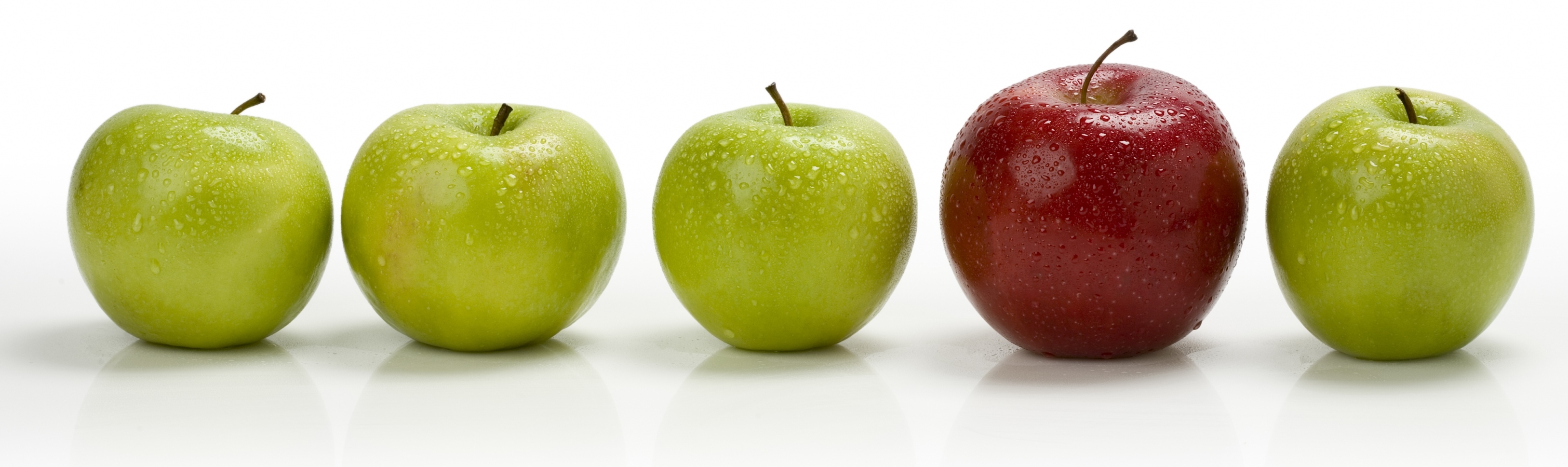
Demo: http://responsiveimag.es/picturefill1_apples.html
In my Demo, I change image payload/response size at 800px and 1000px, and change the visual (different asset requested) below 800, with a separate alternative image requested for non-javascript.
I am using a server-side Dynamic Imaging system to make the image manipulations on the fly (using query string parameters to specify the width, quality, and sharpening to be applied at-request time):
<br />
<picture><br />
<!--[if IE 9]><video style="display: none;"><![endif]--><br />
<source srcset="http://images.amplience.com/i/benco/Apple_Row2.jpg?w=1400&qlt=80&unsharp=0,1,1,7" media="(min-width: 1000px)"><br />
<source srcset="http://images.amplience.com/i/benco/Apple_Row2.jpg?w=800&qlt=80&unsharp=0,1,1,7" media="(min-width: 800px)"><br />
<source srcset="http://images.amplience.com/i/benco/Red_And_Green_Apples2.jpg?w=600&qlt=80&unsharp=0,1,1,7"><br />
<!--[if IE 9]></video><![endif]--><br />
<img srcset="http://images.amplience.com/i/benco/Apple2.jpg?w=400&qlt=80" alt="How do you like them Apples?"><br />
</picture><br />
…?w=1400

…?w=800…
The second part of this overall problem, is in the workflows and solutions for actually sourcing and serving all of those image variants. There are two fundamental approaches:
1) generating batch statics
2) server-side solutions.
- more to come on these topics shortly.
I hasten to add, where feasible and appropriate, you should look outside of raster images for your site’s needs; So SVG, icon fonts, base64 encoding, but for many sites and many use cases, raster images are still the only way to go.
*image powered by Amplience dynamic Imaging