Responsive Images in a Responsive Layout
I’ve been meaning to update my previous responsive images example to be in conjunction with a responsive grid layout (rather than mapping to the whole page width). It’s a relatively small change, but makes for a more real-world use case. I used the rather excellent Initializr to form the initial page template
[Screen shots from Nexus7, where changing orientation causes the grid layout to change considerably, and the container with the image to change by 50px. ]
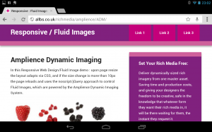
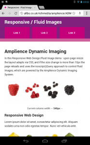
[on my HTC Sensation there is a more considerable 250px variance when switching between lanscape and portrait orientation]
As discussed in Responsive Images #Intro and some follow on posts, I’m still finding pretty consistent success using the jQuery/
The img element is wrapped in a
<noscript data-imageid=’BS1-Raspberry’>
<img src=’http://images.amplience.com/i/bendemo/BS1-Orange?w=250&fmt=jpg’ alt=” />
</noscript>
//data-imageid holds the value of the Image ID for the future Image Requests
Meanwhile for browsers with javascript, a little jQuery is uses .insertAfter to swap in a revised img element instead of the noscript element – this can be based on values passed in the code, or if you have a nice Dynamic Media Platform at your disposal you can programmatically drive the image request by whatever device/screen measures you can retrieve:
$(‘noscript[data-imageid]‘).each(function(){
var ampBase=”http://images.amplience.com/i/bendemo/”;
var imageid = $(this).attr(“data-imageid”);
$(‘<img src=”‘ + ampBase + imageid + ‘?w=’ + (((articlewidth/44).toFixed(0))*10) + ‘&fmt=jpg&qlt=80″ alt=”‘ + $(this).data(‘alt’) + ‘” />’).insertAfter($(this));
});
// only for those noscript elements containing the data-imageid perform a substitution for that ID and my Amplience base URL
// the width for the image request is determined by the logic applied against the current container width : $(“article”).width(); (which is calculated elsewhere (((articlewidth/44).toFixed(0))*10) ensure that all 4 images will always fit in the container.
// this also only makes image requests in increments of 10px to provide a little better caching efficiency (Amplience Dynamic Media assets are served via the Level3 CDN)
You can see the live example here:
http://allbs.co.uk/richmedia/amplience/ADM/
(This test page has an auto reload on page resize bigger than 10px difference, which would be incredibly inefficient for live use, but is useful as for now this is just for demonstration purposes )
Testing on my Android tablet and smartphone switching orientation triggers the reload and this is where I see greater future benefits.
I’d would really appreciate any thoughts and suggestions, questions or comments, my work email address:: bseymour (at) amplience.com (or @bseymour)
(All views expressed are my own, and do not necessarily reflect those of my employer)