Navigating hover menus on a touch device
Mouse-hover driven menu navigation can be a relatively nice user experience on a desktop based browser i.e. one with a pointer object that can be utilised to create a hover state. However, if this same experience is also presented to a touch device (such as a tablet or smartphone) then it can cause some of the navigation options to become unavailable.
When navigating on a tablet, the typical experience is that when you touch the menu item you may briefly see a flash of the sub-menus, before being automatically taken to the category page, or which ever page is the top or default sub-category:


From that category page, you will hopefully find links to the other sub-categories, but if not then you may have to find and then utilise the sitemap to navigate to the page you are interested in.
The workaround :
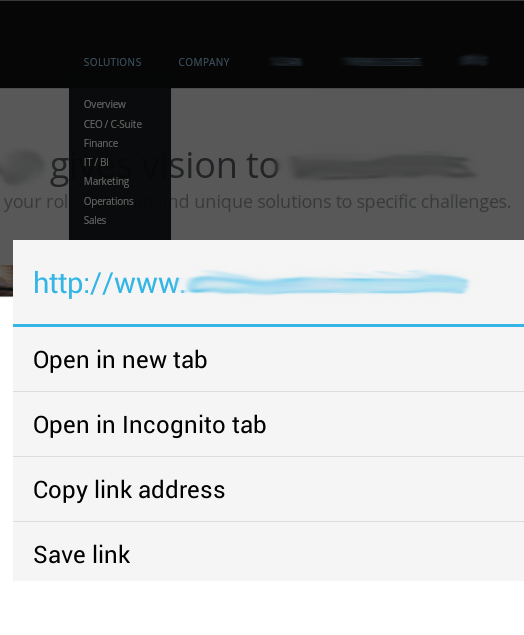
Long pressing on the link (1-2 seconds) causes the link-options dialogue to appear (open in new tab, save link etc..):

If you then touch outside of the options dialogue, the dialogue disappears, but the menu remains in its drop-down state, such that you can then select the sub-menu item you are interested in:


This is the behaviour I see on my Android devices when running Chrome browser – I hope it works for you. I’d appreciate any feedback regarding the behaviour on other OSes and browsers, and I’ll update the post accordingly.
(I have endeavoured to hide the identity of the particular site that these screenshots came from – there are many examples out there which provide a similar hover-based navigation experience for touch driven devices, my intention is not to highlight any site, just the workaround)