Responsive Images – test #2
Here are details of my second test implementation of Responsive Images (a.k.a. Fluid Image) using the
Following on from :: Responsive Images Test #1
(and Responsive Images – #intro )
[Note: As my Scene7 account is no longer active, live demo’s will no longer work]
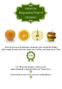
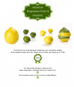
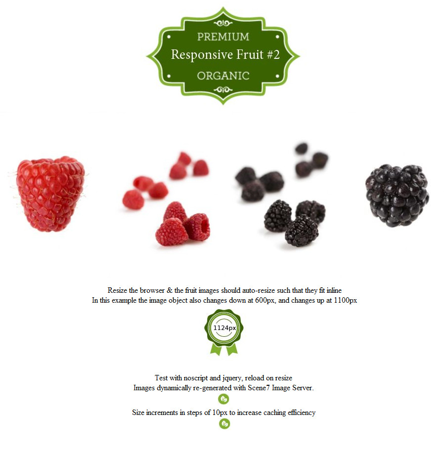
This is a variation on test #1. In this example the noscript element contains attributes with values for the Image ID at normal sizes ‘data-imageid’ , and alternate Image IDs for small ‘data-small-imageid’ and large sizes ‘data-large-imageid’.
<noscript data-imageid=’Lemon’ data-small-imageid=’Orange’ data-large-imageid=’Raspberry’><img src=’http://s7e2a.scene7.com/is/image/benco/Orange?wid=250′ alt=” /></noscript>
A couple of javascript variables are set to determine the widths at which those different alternates are shown. These values could also be passed in via attributes in the noscript element, which would again make this a more viable real-world solution.
Live example: http://allbs.co.uk/richmedia/scene7/noscript_test2.html
Testing on my Android tablet and smartphone, switching orientation triggers different content to be loaded, and this is where I see greater future benefits – perhaps not in changing the product content so radically, but there could certainly be benefits in having such design control also over images in a responsive design layout.
(Note: for this test I have only so far tested the values are suitable for my Android smartphone and Android tablet – it is quite likely that there will be many devices for which this demo is not yet optimised – hopefully at some point my ‘device testing lab’ will have more toys in it 😉 )
I’d would really appreciate any thoughts and suggestions, questions or comments, my work email address:: bseymour (at) adobe.com (or @bseymour)
(All views expressed are my own, and do not necessarily reflect those of my employer)


